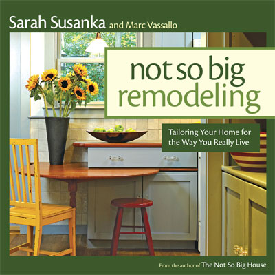
 When Sarah Susanka first published The Not So Big House in 1998 we immediately recognized an ally. Sarah’s readers gratefully embraced her simple message: good design guidance favors quality of space over quantity of space. Build better, not bigger. Now that’s sounding like prescient advice.
In the highly successful series of books that followed, our work was chosen to help reveal that guidance in practice. Inside the Not So Big House (2005) devoted a full chapter to a Wolfworks project rich in detail and inspired craft. Published this year, Not So Big Remodeling features four Wolfworks projects in Greater Hartford and the Farmington Valley that reveal the principles and design “moves” that form the book’s content, a comprehensive and clear exposition of the careful design thinking that we practice every day.
Not So Big Remodeling is organized to reveal design strategies for the functional spaces of a home, outside and in, and what can be accomplished across a spectrum of complexity and investment. It favors effective moves that do not require ambitious projects or large budgets.
REGISTER to attend the October 6th Open House at one of the featured homes.
Here is a key to the content that our projects provided to this invaluable guide, listed by section title and page numbers. Click on an image to view the project profile on our site.
![]()
Back Entries Pages 60-61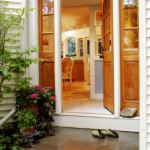
Our projects illustrate several useful approaches to making the entry we use every day as important and inviting as the less used entry that has traditionally been given all the design attention, for “curb appeal”, out front.
Kitchens: Adding On Page 140
It’s often only necessary to add a bit of space to the back of a house to accomplish all that is needed; no need for a whole new room. Our project here is pictured, inside and out, to show how this small effort makes a large impact.
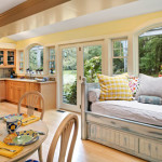 Kitchens as Catalyst Page 153 Top
Much of our work is transforming isolated and poorly functioning kitchens to become the hub of the home, open and socially connected to adjoining space and often, with easy access to the outside
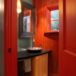 Powder Room as Artful Expression Pages 202-203
In this featured case study(#26) a remodeling move (dubbed “The Jamie”) creates many opportunities. The focus is on the delightful and expressive powder room we were able to create in a new location.
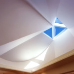 Up in the Roof Pages 262-63
This case study(#37) focuses on the way in which the shape of the roof inspired the design of this remarkable master suite remodel, a project originally featured in Inside the Not So Big House.
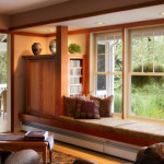 Putting it All Together Page 270
The image for this chapter heading shows a detail from the next project feature, a cleverly concealed TV cabinet that forms one end of a window seat defined by a dropped ceiling at the end of a sitting room that opens to a delightful screen porch.
 Breaking up a Box Pages 280-83
In an exchange with co-author Marc Vassallo, Sarah considered the transformation of this once boring façade “masterful”. This four page case study (#40) describes another “Jamie” move that made the whole project work: new rear entry, porch, screen porch, mud room, powder room, kitchen, eating area, window seat, sitting room and newly isolated “away” room. Big changes leveraged by a single idea.
